In the Land of Queen Anne’s Lace 2
October 20, 2016
October 24, 2016 Update: Andy Hooker’s comment (see below) made me want to make the comparison between black and white and color versions of this photo. So I added them.


October 20, 2016
October 24, 2016 Update: Andy Hooker’s comment (see below) made me want to make the comparison between black and white and color versions of this photo. So I added them.

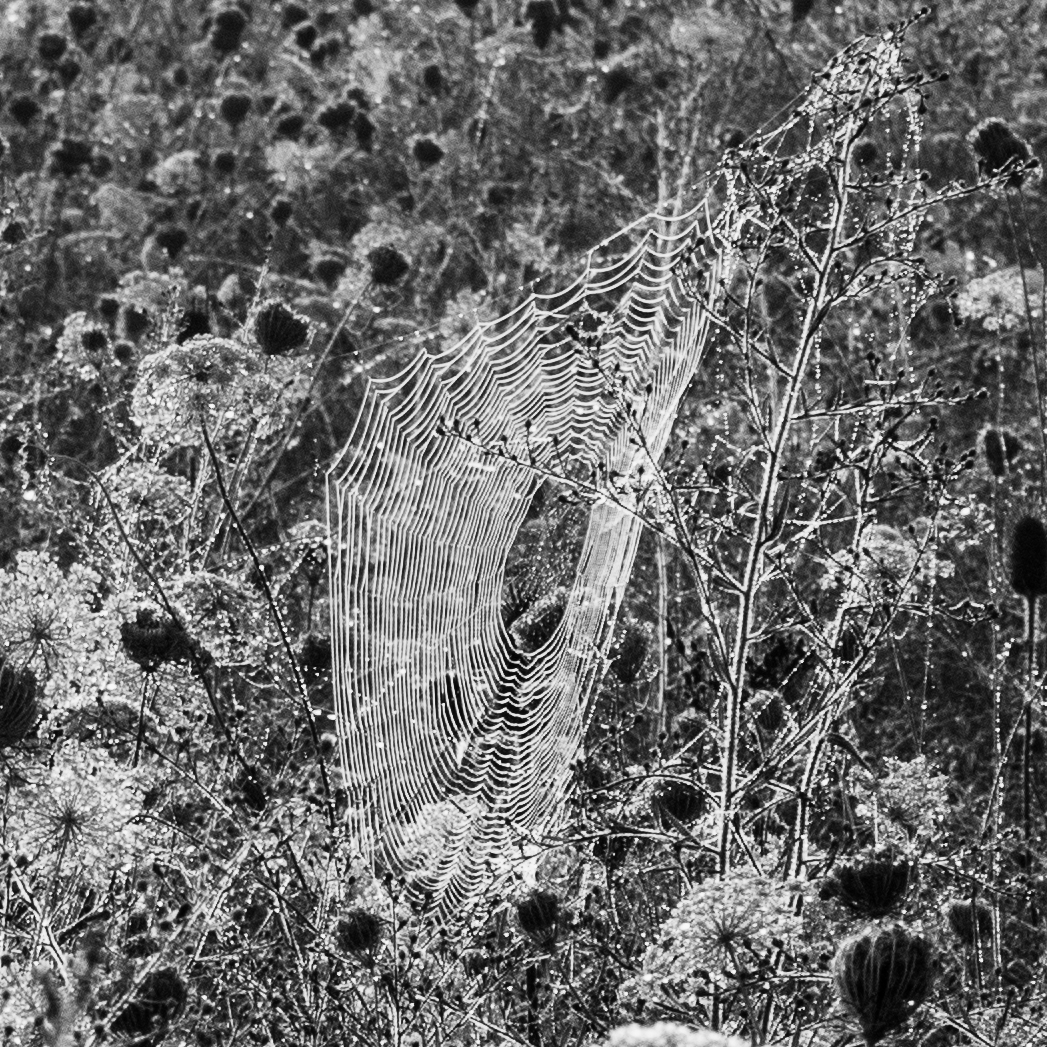
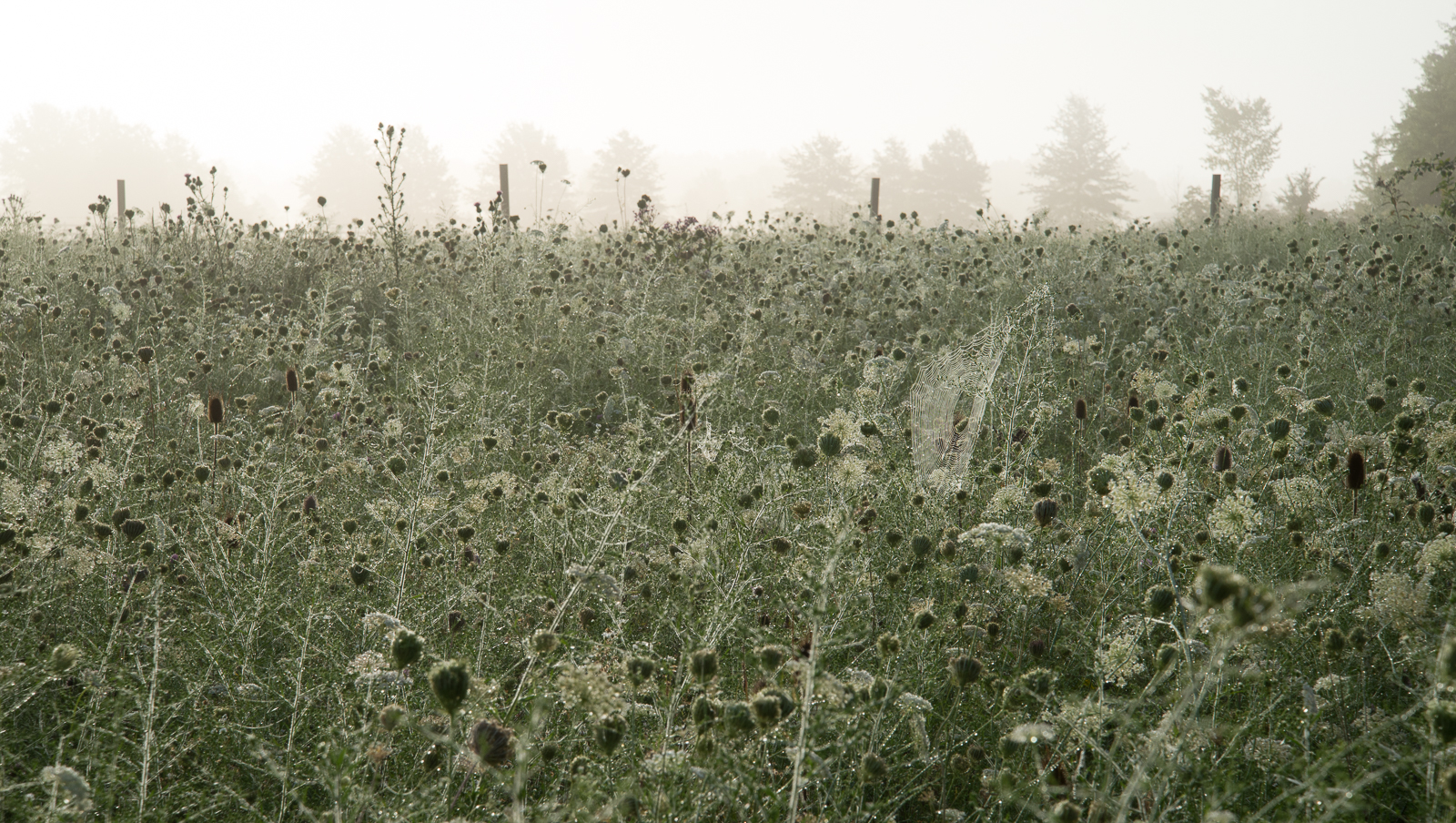
I looked at the first image, saw the Web and thought: that would make a picture on its own. And I scrolled down and there it was!. I have to say, somewhat to my surprise, that I liked the colour image better. Sometimes colour that is subtle can have a disproportionate impact on an image. But that is a personal opinion.
LikeLike
October 24, 2016 at 2:31 PM
OK, I just added the color versions of this photo to the blog post, Andy, so you can see the comparison. To tell the truth, I don’t know why I made this image black and white when I first processed it two years ago. Maybe so it wouldn’t look so much like the previous image??? Now, not comparing In the Land of Queen Anne’s Lace 1 with In the Land of Queen Anne’s Lace 2, I think you’ve won me to your side. In general I do like subtle color, though you’d never know it from some of my photographs.
LikeLike
October 26, 2016 at 9:23 PM
I think the joy of colour is that sometimes it can be stand-out colour and sometimes it can be ever so subtle. And it’s also true of B&W – you will know that I like my B&W images to be bold, but I do also enjoy the high-key images too
LikeLike
October 27, 2016 at 4:48 AM
There’s so much to like in photography!
LikeLike
October 27, 2016 at 10:34 AM
I like the color images better here, but i respect you for doing both! There is already some abstraction going on in the image so no need to convert to B & W to emphasize abstract forms …and the forms get too confusing for me in B & W. Plus that soft green is gorgeous, and the wetness holds up well. I like the web, too!
LikeLike
October 26, 2016 at 9:15 PM
Thanks for your vote on these, Lynn. I have to agree. As I told Andy, I had a trivial reason (if I remember it right) for going to black and white. Glad he called me out on it, and gave you the chance to agree.
LikeLike
October 26, 2016 at 9:22 PM