Playing with the Landscape at Schoepfle Garden
June 9, 2019
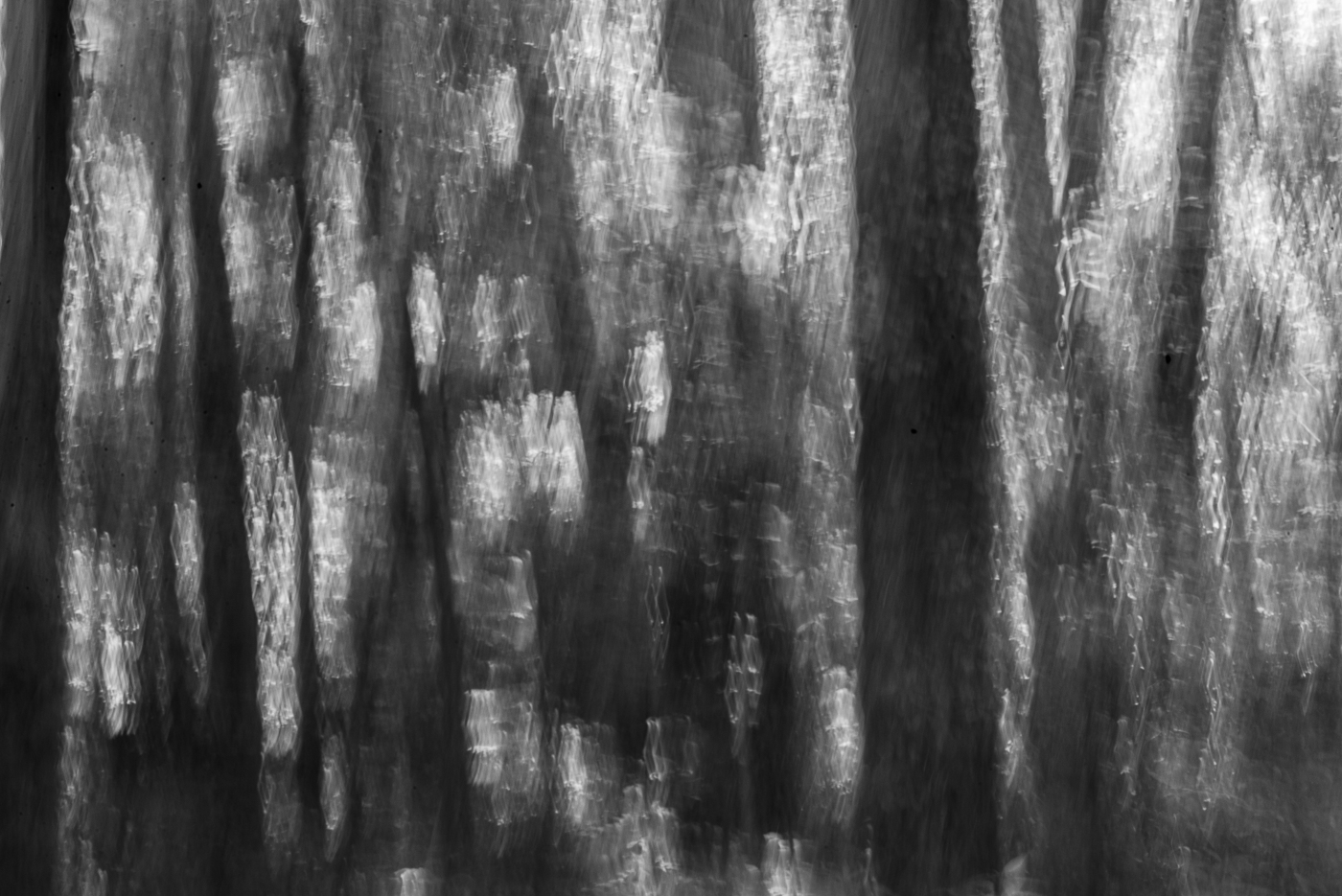
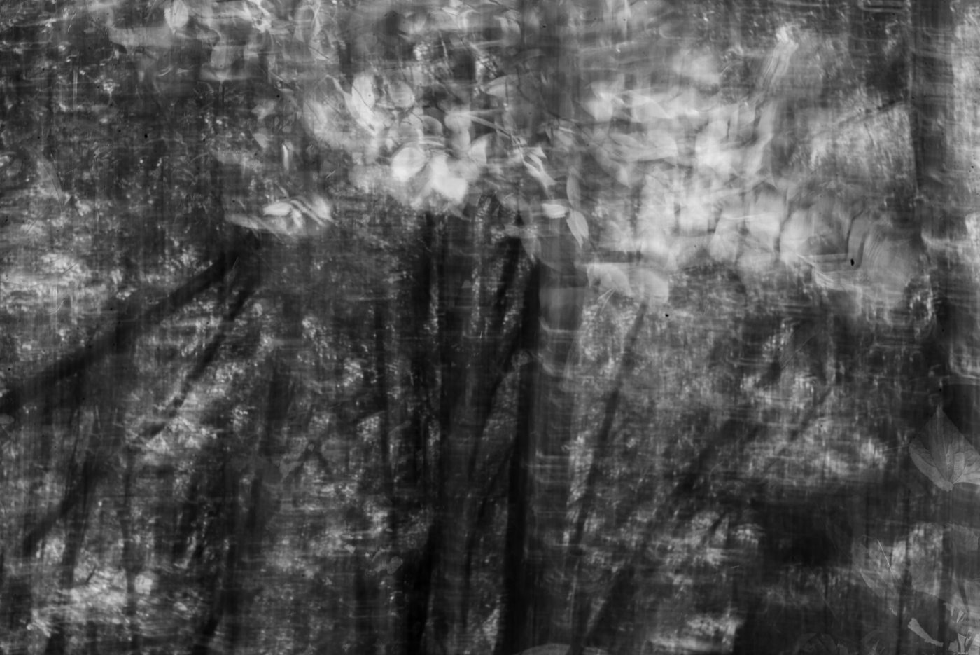
It’s happened again: the feeling that I’ve gone stale, taken my life’s quota of decent photographs, and all that’s left is to repeat myself. It doesn’t help that we’ve had so much rain that I can’t even get close to the river, let alone walk across it to the other side, where all the good photographs are. (You may recall the fence on the other side of which the grass is always greener.) I was in Schoepfle Garden yesterday hoping to discover something. I was prepared to try intentional camera movement if nothing came along. And it didn’t. ICM is always a crapshoot (think of the ways you can read that word). So when I downloaded, I didn’t expect to find a lot of treasures. But I did think I’d find a few. What I found was very few—so I tried going black and white with the best ones. The B&Ws may be my favorites. I wonder what you think. I also wonder if it will ever stop raining long enough for me to get next to the river. I need to get out of this slump . . . maybe a completely new location . . . or is that the fence with the greener grass on the other side, too . . .


The B&Ws are my favorites, too. I’ve had only minimal luck with ICM. Your shots are far better than anything I have in the can. You may have a natural talent for this. In any case, it’s a project worth pursuing.
LikeLiked by 1 person
June 9, 2019 at 7:39 PM
Thank you, Ken. It’s good to have ICM to fall back on when I can’t find anything pure. They do take A LOT of playing around with in Lightroom. And the first two required Photoshop as well. You should see how many went into Trash.
LikeLike
June 9, 2019 at 7:48 PM
My predilection is usually for keeping the color.
By coincidence, today I also showed experiments involving intentional movement, though of the subject rather than the camera.
LikeLike
June 9, 2019 at 9:53 PM
Thanks for weighing in on my question, Steve. I loved my green surroundings when I was taking these photographs; I just didn’t think I’d translated them to photographs as well as I thought I might at the time. Fun to see your flower in the wind on your site.
LikeLike
June 10, 2019 at 9:42 AM
I think these shots have all worked very well, both in the colour and black and white versions. I like them a lot. I think it is worth continuing with the experiment. You might be interested in a book that I recently discovered – “Why it does not have to be in focus, modern photography explained ” by Jackie Higgins, published by Thames & Hudson. It is full of interesting concepts and ideas. There is always more than one way to look at things and endless scope for creative experimentation.
LikeLike
June 10, 2019 at 2:43 AM
Thanks, Jessica. I’m pleased you like these. Yes, I am interested in that book; will track it down.
LikeLike
June 10, 2019 at 9:52 AM
I go for the color because that’s where the rhythm seems to be in these. I agree with you that ICM is a crapshoot, but when it works it really works.
LikeLike
June 10, 2019 at 8:38 AM
Hi, Michael. Can you say more about rhythm in photographs? ICM is fun to do, and finding the few that work is worthwhile, but what a long while it takes to find and create them as final images!
LikeLiked by 1 person
June 10, 2019 at 3:18 PM
In your recent photos verticals of the tree trunks form a really nice rhythm. It’s more apparent in color than in monochrome. ICM works best if you can previsualize and then move the camera to mimic what you saw. And even then it’s a crapshoot.
LikeLike
June 10, 2019 at 6:08 PM
OK, I get it now. Looking at the photographs again, I notice that the B&W look (to me) flatter. Do they look that way to you?
LikeLiked by 1 person
June 10, 2019 at 7:58 PM
Yes. Exactly. Rhythm depends on regular repetition of contrast changes. In this case, the photos have more chroma contrast than luminous contrast, so chroma stands out more prominently. That’s why color looks better on these, to me.
LikeLike
June 10, 2019 at 9:15 PM
Aha. I get it. I may still prefer the B&Ws, perhaps because I seem to like things flat. But now I understand more about the difference. Thank you!
LikeLiked by 1 person
June 10, 2019 at 9:34 PM
Great! In the end your own preference is senior.
LikeLike
June 10, 2019 at 9:35 PM
Yes, but I like knowing others’ and why. 🙂
LikeLiked by 1 person
June 10, 2019 at 9:38 PM
Knowing why is the key. That can inform your decisions going forward.
LikeLiked by 1 person
June 10, 2019 at 9:40 PM
Look at the horizon abstracts on my fine-art site. A lot of these depend to some degree on rhythm to work.
https://www.amagaphoto.com/portfolio/C0000FrL4JChJdck/G00002Agt1FWWkdg
LikeLike
June 10, 2019 at 9:17 PM
Oh, I do love these. I think this is my third time looking at them. I think I see what you mean.
LikeLiked by 1 person
June 10, 2019 at 9:37 PM
Thank you very much. The rhythms are subtle in a lot of them. And not necessarily always the most prominent feature.
LikeLike
June 10, 2019 at 9:40 PM
Well, Linda, b+w fan that I am, I have to say that I prefer the colour versions in every one of these – the colour versions just seem to have a vitality and “aliveness” that the b+w ones don’t – very good stuff! A 🙂
LikeLike
June 11, 2019 at 2:26 AM
Thanks, Adrian. You’re forcing me to think more about why I prefer the B&W versions. It isn’t only that sometimes I like things flat. In fact, that doesn’t answer much at all. Why do I sometimes like things flat? Is it because the flatter B&W is even more abstract, showing more of my hand than a color photograph, which is closer to the reality of the woods? Of course that leads to the next question, I suppose. Why do I prefer more abstraction, more showing of my hand? I don’t want to think it’s only an ego thing, that the photograph is all about me, me, me. Maybe it’s that the B&W on top of the ICM on top of the photograph itself indicates increased interaction with the thing itself.
LikeLiked by 1 person
June 11, 2019 at 11:25 AM
I’m glad I’ve made you think; thinking about such things is useful/healthy, even if no firm conclusions emerge. But we are all different. I don’t think about such things about myself, I just look at images – and, the bottom line, if the image looks good it is good. A 🙂
LikeLiked by 1 person
June 11, 2019 at 11:47 AM
“…the feeling that I’ve gone stale,…” I know that feeling so well! Having said that, these images look like a nice step away from that; I hope they feel that way to you. This is such a nice exploration on several levels. The black & white vs color is interesting; I’m glad you posted both versions of each image. I usually prefer B&W but a quick look through them I was really struck by the vibrant colors. But when I went back through and studied them, I found the B&W so much more interesting.
LikeLike
June 11, 2019 at 10:15 AM
Yes, Mic., these images are a step away from my staleness in that they are fast and loose—at least during the taking stage—as opposed to slow and deliberate, the way I usually work. I’m not sure I want to give up on slow and deliberate in the long run, but fast and loose is fun. I didn’t start out thinking I’d post both versions of all these photographs. But after I decided to show two versions of one of them—because I couldn’t make up my mind about which version was better—I began to notice a different feeling in the color versus B&W. Eventually I came around to thinking one version may not really be better than the other. Instead, it was a matter if which I preferred. The difference was interesting to me, so I decided to post them both. I’m glad you enjoyed thinking about these photos. Thank you for weighing in. By the way, the vibrancy of those greens is what I loved in the forest, but not as much on my computer screen; that may be why I played with B&W.
LikeLiked by 2 people
June 11, 2019 at 2:12 PM
Oh, this business of aesthetics is so complicated! 🙂 Sometimes, maybe most times, evaluating one’s response to an image is as important as trying to evaluate the image itself. Hence your observation that one was not better than the other but rather which you preferred. I’m trying to do more of that…mindful observation rather than critical analysis.
LikeLiked by 1 person
June 13, 2019 at 11:20 AM
First, I’m sorry you’re inundated – that’s got to be unpleasant. I heard something on the radio about the farmers not being able to plant, or to get their loads of fertilizer from the ships stuck on the Mississippi, etc. etc. Crazy. Better to be a photographer in a slump than a farmer these days, I suppose. But that’s no help. (Yes, jump on a plane!)
I think you were smart, deciding to change it up as a way of breaking the slump. Yeah, ICM means taking lots of photos, not knowing what you’ll get, and then you have to really look hard to understand whether you can make anything out of what you have. Converting to black and white was a good idea too. You may be in a slump but you haven’t lost your mind, my dear. 🙂
Now I’ll take them one by one. The first one I really like, in black and white. It dances, it’s mystical, it talks about the forest in a way that we sense is true. #2 doesn’t appeal to me as much, but again I prefer the black and white, and this time it seems like it could be underwater, which is interesting. #3 seems to me to be the most interesting one, and I like both versions very much – wow, they have such different feelings, too. I find the color version very exciting, because the ground is almost still, like ground “should” be, and the colors strongly demarcate moving from still. The ground comes forward, too. It starts to look like cross section through the dirt, which is intriguing. (I was going to say cool but I thought I should use a bigger word). So I’m inclined to prefer the color, but when I get to the B&W I really like that as well. Now it looks like the extra-terrestrials are landing in the woods, and we should rejoice, not run, because they’re bringing peace. 😉 Seriously, beautiful things (light, actually) are raining down in this image. You can even hear it – a Whoooomph! The last one – I think I like the monochrome best again, it seems to have a transcendent quality. I think you should remove that black spot on the right, it’s distracting – just my opinion. There s a depth to this one, it looks like it might be a reflection, but maybe not, and I the ambiguity keeps me interested.
What I think the color versions lack, except for the third one, is variety of hue. I know it’s hard to add if it’s not there in the first place, but have you ever played with LR split toning? E.g. tone the highlights towards the red-orange end of the spectrum and the shadows towards the blue-purple end, play with it, and then it should look a bit less flat, if that makes sense.
I purposely did not read anyone else’s comments yet – trying not to be influenced by what others say. But I will now. 🙂
LikeLiked by 1 person
June 11, 2019 at 8:35 PM
The inundation is unpleasant for me, but unlike the farmers, I suffer no economic consequences. I think #3 is the most interesting, too. I’d like to reproduce the way that one worked, with the foreground almost clear and the rest so smeary. I’m sure I panned from the ground up, and probably pointed the camera at the ground longer than at the trees and sky. But how long in each direction? I didn’t even note my shutter speed, though it was probably 1.2 seconds. I know my aperture was stopped down as far as possible. But I’m not one to take notes, and my memory is useless for this sort of thing. You said, “light . . . raining down”; I had that feeling, too. If your “black spot” is the dust-on-the-sensor black spot that I see, it’s gone now, along with many of its brethren. Thanks for keeping me honest; I was letting that slide. Yes! Lack of variety of hue is exactly what is missing! I have played with split toning, but I didn’t with these. But I will now. Thanks, as always, Lynn, for all your comments, including those about the extraterrestrials.
LikeLiked by 1 person
June 14, 2019 at 3:06 PM
I like the color and black and white equally.
LikeLike
June 12, 2019 at 11:01 PM
I’m curious, Alan. What do you see as the differences between the two versions, if any (besides one is in color and one in black and white)?
LikeLike
June 13, 2019 at 12:16 PM
I’m afraid I have no answer to your question, Linda, aside from the obvious difference. Also, I’m not sure if there’s even any value in over-thinking or over-analyzing the relative merits of each.
LikeLike
June 14, 2019 at 12:14 PM
OK, Alan. Thanks.
LikeLike
June 14, 2019 at 2:23 PM
Great set!
LikeLike
July 21, 2019 at 4:09 AM