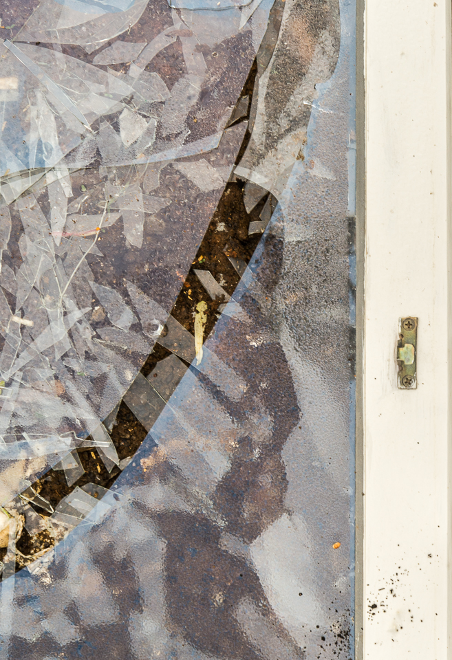
Gone to Pieces 3
June 22, 2018
I’ve had some second thoughts about the photographs in the Gone to Pieces series. Specifically, I’ve been wondering whether the glass shards are too blue in the original Gone to Pieces 1 and 2. I can’t go back and check because the dumpster in which I photographed them has had many other pieces of construction/deconstruction debris added to it, and I can’t see the broken window anymore. For the first photograph in today’s post, Gone to Pieces 3, I toned down the blue with the neutral grey eye-dropper thingie in Lightroom. Then I went back and did the same thing to the photographs in Gone to Pieces 1 and 2. I added them below. It’s interesting to see that as the blue goes away, the orange becomes more intense. I’d be interested in knowing your thoughts about what I did, and whether you have a preference for one version over the other.


My personal preference is for the original blues. I don’t think they were too intense but then I didn’t see the real thing – though I’m not sure that that is relevant. Also, how does my screen compare to yours? Are they set slightly differently? It seems in the blue shots that there is more density evident in the glass that is overlapping and therefore thicker, which seems logical. Without being able to go back to the scene so-to-speak, I would trust your original judgement, but that doesn’t stop you doing other versions as well. Either way I like all the layers in these images.
LikeLike
June 22, 2018 at 5:09 AM
It’s your saying, “I’m not sure that that is relevant” that speaks most forcefully to me, Alastair. But I also like “that doesn’t stop you doing other versions as well.” Thanks for weighing in on this.
LikeLiked by 1 person
June 22, 2018 at 9:15 AM
When I process photos for the Museum, I strive to provide the most accurate color representation possible using the equipment provided. I’ll use a gray card in the first photo as a reference and that helps a lot in the studio. At home, I have a calibrated HP monitor (about 8 years old) but I don’t make too much effort to provide an accurate color for any of my own photos. I play with sliders with abandon until I’m pleased with an end result. Outdoor subjects (like glass or snow) sometimes pick up a lot of blue from the sky. But there is no blue snow. Unless you’re obsessed with accurate color, let your heart be your guide.
LikeLike
June 22, 2018 at 8:02 AM
I think that’s what I did with the original photos of the first two posts in this series: I let my heart be my guide. I wonder if my second guesses are because I wonder if other people will think I am being untruthful. I even told myself that the blue was from the sky—and then I fretted that it might not be. Shoot. I need a louder heart. Thanks for turning up the volume, Ken.
LikeLike
June 22, 2018 at 9:20 AM
I agree with oneowner about letting your heart be your guide. I like both the blue and the rusty images although my personal preference is for the rustier looking pieces. I don’t know a lot (make that almost nothing) about photography. I would approach this from the aesthetic and emotional/evocative side of things, making something that pleases the eye and your heart.
LikeLike
June 22, 2018 at 8:46 AM
I’m glad you know “almost nothing” about photography, Clare. That means you are speaking from your position as artist-in-general, not artist-as-photographer, approaching the question, as you say, “from the aesthetic and emotional/evocative side of things.” That makes it all the more interesting that you agree with artist-as-photographer Ken about going for what “pleases the eye and [my] heart.” (I don’t mean to assume that Ken is not also an artist-in-general; he may be.) Anyway, I’m glad you gave your opinion here and find it interesting that you prefer “the rustier looking pieces,” which may be closer to reality. I suspect that the reason you prefer the rustier look has nothing to do with reality and everything to do with just plain liking the orangey look.
LikeLiked by 1 person
June 22, 2018 at 9:52 AM
I love the orange, Linda! M
LikeLike
June 22, 2018 at 9:48 AM
OK, Marjorie! Duly noted. Thanks for responding.
LikeLike
June 22, 2018 at 9:53 AM
Color is very subjective, so subjective, that if you think about it, it’s possible that not only is each person’s reaction to a given color likely to vary, but one’s own reactions are likely to vary over time. You could achieve a scientifically correct match, I imagine, using some kind of specialized equipment on site, or you could try to get as close to that as possible with the tools you have, and that would be worthwhile. Then you could look at the result and see how you feel about it, and if you felt like intensifying a color more, or less, that too would be valid and worthwhile.
As for what appeals to others, there’s always the question of their computer or device screens – what would the image they see look like next to the image you see on your screen? But setting that aside, because you have to (!), maybe, maybe you can come up with some general agreements about colors, or fidelity to nature. But the agreements would probably be limited.
Seeing these three together, they do seem very different, and if I were going to show them together I’d want to make them more uniform, either all cooler and less saturated or all warmer and more saturated, for example. There are so many possibilities – it’s interesting that you toned down the blue, but not the orange. The first one here is very cool, and I like the inherent contrast between the cool blues and warm oranges in the others, but then, in the third one the orange is a little too bright for my “taste.” We can go on and on! 🙂
One other thing – I usually work with the individual color sliders – luminance, saturation, hue – I’ve never used the neutral gray eyedropper. Got to try that! Which brings up white balance, another valid concern.
Now reading the other comments (I waited til I could write mine) I agree with what Alastair said and of course, Ken’s “Let your heart be your guide.” I love your answer about needing a louder heart!
This ongoing struggle is producing some really good art, don’t forget that.
LikeLiked by 1 person
June 22, 2018 at 2:12 PM
Your first paragraph convinced me that I want to do no such thing, so I’m skipping directly to letting my heart be my guide. The beginning of your second paragraph also makes me skip to deferring to my heart.
About the “all three” in your second paragraph: The first image was number 3. It’s from a different part of the broken window, where dumpster floor had not rusted, so there was no orange. The two images below that are the versions of 1 and 2 (in the previous posts) in which I controlled only for the blue, with the eyedropper.
By now this discussion is probably boring for both of us. You need not respond!
LikeLiked by 1 person
June 27, 2018 at 3:10 PM
I like the more emotive direction you’ve taken the top image compared to the originals. There’s an interesting and somewhat nostalgic color harmony there which I find appealing. I also agree with Lynn’s comments about monitor calibration (not to mention the light in the room one’s computer is situated in).
LikeLike
June 23, 2018 at 11:28 AM
Thanks for your comments, John. I think this was a particularly unclear post on my part. I apologize. You can see how I tried to straighten things out in my reply to Lynn (bluebrightly) above. I’m happy that you like one of these images, John. I’ll try to write more clearly from now on.
LikeLike
June 27, 2018 at 3:12 PM
There are a lot of images where ‘colour’ needs to be accurate, but then there is other work – like these image – where the truthfullness of the colour is unimportant (not relevant) as said in an earlier comment. In those instances the only time colour does become relevant is when we show a gallery or panel of images from the same place and then I think matching the colour does become important. Leaving that point aside, I would always say – go with what looks right to your eye. Overall I think I prefer the glass less blue, but that is a purely personal thought.
LikeLike
June 25, 2018 at 3:10 AM
Thanks, Andy. I think I need to stop worrying about the truthfulness of the color. It’s a hard thing for me to do. And thanks for your opinion on these.
LikeLiked by 1 person
June 27, 2018 at 3:14 PM
Not much to add to what others have said. I can go with either version, each has a certain validity to my eye.
LikeLike
June 28, 2018 at 11:38 PM
Thanks for commenting, Alan. Glad to know they both work for you.
LikeLike
June 29, 2018 at 4:21 PM